
|
Getting your Trinity Audio player ready...
|
How to Design a Book Cover That Sells More Copies
Before a reader reads your title, before they read your name, before they read a single word of your description they see your cover. That split second is where the decision begins.
A strong cover pulls a reader in. A weak one sends them straight to the next book. And in a marketplace where thousands of books compete for attention every single day, learning how to design a book cover that works is not optional. It is essential.
This guide breaks down exactly what makes a cover sell and what common mistakes quietly kill book sales before the reader ever gives the writing a chance.
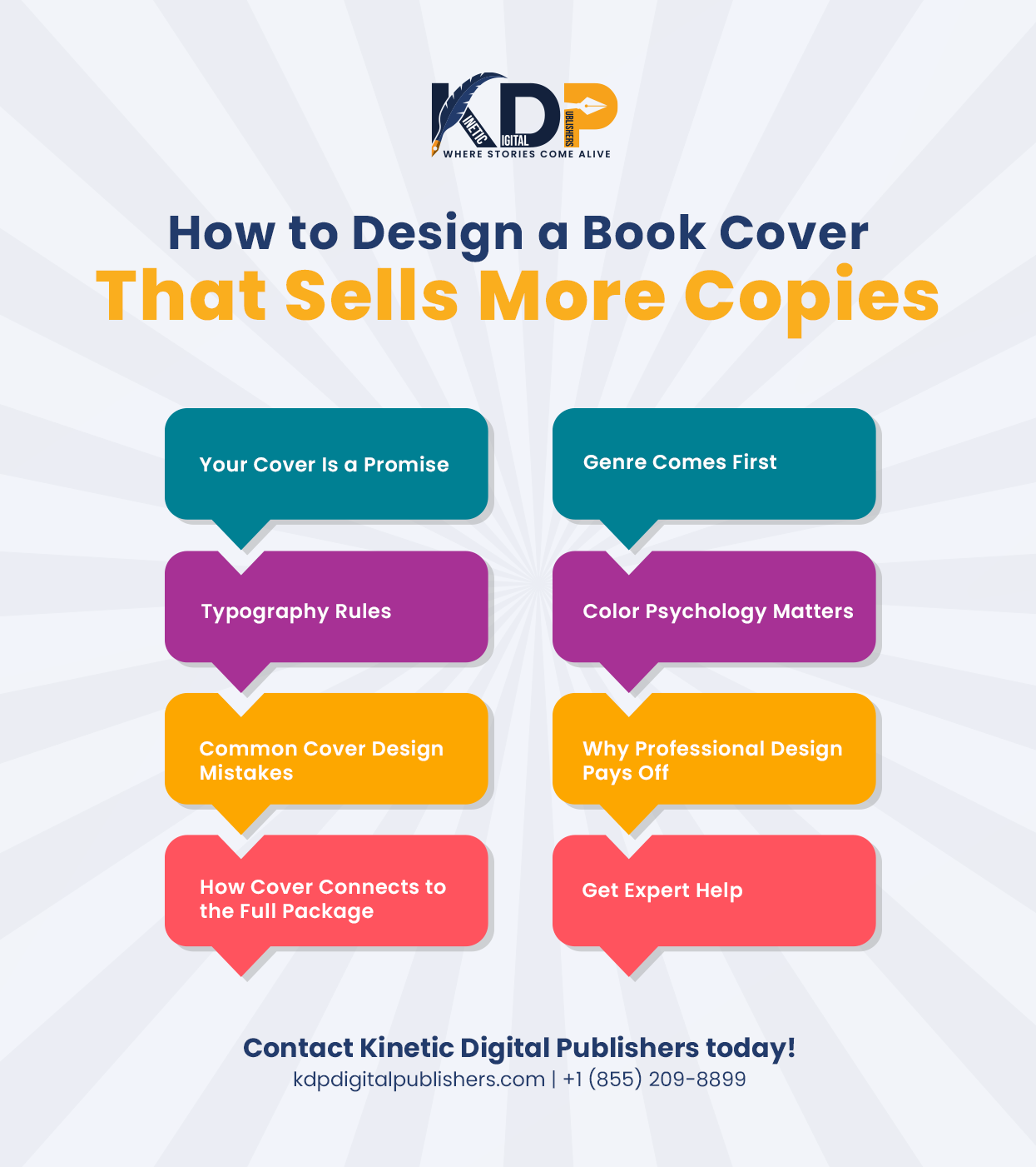
Your Cover Is a Promise to the Reader
Think of your book cover as a promise. It tells the reader what kind of experience they are about to have. A thriller cover should feel tense and dark. A romance cover should feel warm and emotional. A business book should feel sharp and credible.
When your cover matches what is inside, readers feel satisfied. When the cover does not match, they feel misled. That disconnect leads to poor reviews, low ratings, and readers who never come back.
The best book covers are not just pretty. They are accurate. They communicate the genre, the tone, and the audience in one clear image before a single word is read.
The Role of Genre in Cover Design
Genre is the most important starting point for any cover. Different genres have different visual rules — and breaking those rules costs you readers, even if the book itself is brilliant.
Look at the bestselling books in your genre before you design anything. What colors do they use? What fonts? What kind of images or illustrations? You are not copying them. You are learning the visual language your readers already trust.
When a reader browses a fantasy shelf and your cover looks like a business book, they skip it. When your thriller cover looks like a children’s picture book, they do not take it seriously. Fitting your genre visually is not about being generic it is about being instantly understood.
Typography Makes or Breaks a Cover
Most authors think the image is the most important part of a cover. It is not. Typography the way your title and name look carries just as much weight and is often what gets noticed first.
Your title needs to be readable at thumbnail size. This is non-negotiable for ebook cover design because most readers will see your book as a small image on a phone screen before they ever see it full size. If they cannot read the title clearly in a thumbnail, they scroll right past.
Font choice also communicates personality. A serif font with sharp edges feels different from a soft handwritten one. A bold all-caps title feels different from a delicate script. Every font choice sends a message make sure yours sends the right one for your genre and story.
Color Psychology and What It Does to the Reader
Color is felt before it is thought about. Readers respond to color emotionally and instantly, often without knowing why.
Dark colors like navy, black, and deep red tend to signal tension, mystery, and seriousness. They work well for thrillers, crime, and horror. Warm tones like gold, amber, and soft orange suggest inspiration, warmth, and transformation fitting for self-help and memoir. Bright, clean colors signal energy, positivity, and accessibility, which works well for business and personal growth books.
None of these are fixed rules. But understanding what colors communicate helps you make deliberate choices instead of just picking what looks nice to you personally. The reader’s emotional response to your cover begins with color before they read a single word.
Common Cover Design Mistakes Authors Make
This is where a lot of self-published books fall short and the mistakes are more avoidable than most authors realize.
Here are the most common ones to watch for:
- Choosing a font that is too thin or too decorative to read at small sizes
- Using a generic stock photo with no connection to the story or topic
- Cluttering the cover with too many elements competing for attention
- Picking colors that feel personal but do not fit the genre
- Making the author name larger than the title on a debut book
Every one of these mistakes signals to the reader consciously or not that this book was not made with care. And if the cover does not look cared for, why would they trust the writing inside?
Why Professional Design Pays for Itself
A lot of first-time authors try to design their own cover to save money. The problem is that design is a skill developed over years. What looks good to an untrained eye and what actually performs well in a competitive market are often two very different things.
A professional designer understands hierarchy, balance, color theory, and genre expectations all at once. They know how your cover will look at full size, at thumbnail, in black and white, and on a phone screen. They think about all of these things simultaneously and that level of thinking shows in the final result.
Investing in professional book cover design services is one of the highest-return decisions you can make as an author. A cover that converts browsers into buyers pays for itself with every single sale.
How Cover Design Connects to Your Full Publishing Package
Your cover does not exist in a vacuum. It works alongside your book description, your interior formatting, your editing quality, and your marketing to create an overall impression in the reader’s mind.
A stunning cover that leads to a poorly edited book creates disappointment. A great cover with a weak description on your Amazon page means readers stop before they even get to the buy button. Everything needs to work together.
Complete publishing solutions for authors take care of the full picture from expert book editing support that polishes your manuscript to book marketing strategies for authors that get your finished book in front of the right readers. Your cover opens the door. The rest of the package keeps them inside.
Conclusion
The cover is not decoration. It is your book’s first conversation with a stranger and that conversation either earns their attention or loses it in under two seconds.
When you take the time to design a book cover the right way one that fits your genre, communicates clearly, and looks completely professional you give your writing the best possible chance of being read by the people it was meant for.
Your story deserves a cover that does it justice. If you are ready to create one that truly sells, drop us a line and let Kinetic Digital Publishers design a cover your readers will not be able to scroll past.
FAQs About How to Design a Book Cover
Q: What are the most important book cover design tips for first-time authors?
Match your cover to your genre visually, keep the title readable at thumbnail size, choose colors that fit the emotional tone of your book, and avoid cluttering the design with too many competing elements. The best book covers communicate clearly and instantly simplicity almost always outperforms complexity.
Q: How important is professional book cover design for a self-published author?
Extremely important. Your cover competes directly with traditionally published books that had professional designers behind them. A self-published book with a weak cover will be skipped regardless of the writing quality inside. Professional design signals credibility and earns the reader’s trust before they read a word.
Q: What makes a good ebook cover design different from a print cover?
Ebook covers must be readable and striking at very small sizes since most readers first see them as thumbnails on a phone or tablet. Bold fonts, strong contrast, and simple imagery perform best digitally. Print covers have more room for detail, but both versions should feel consistent in style and tone.
Q: What are the most common cover design mistakes authors should avoid?
Using fonts too thin to read at thumbnail size, picking stock images with no connection to the content, making the cover too busy with competing elements, choosing colors based on personal preference rather than genre, and making the author name more prominent than the title on a debut book.
Q: How do I find the right book design services for my specific genre?
Look for a design team that asks about your genre, your target reader, and your book’s tone before starting. Review their portfolio and check if their previous covers fit different genres appropriately. A designer who understands your reader will always produce a more effective cover than one who just makes something visually appealing in general.